On 21 April 2015, Google rolled out a new search indexing algorithm that ranks mobile friendly sites higher and ranks lower sites that are not mobile friendly. This important change for ranking websites on Google has been dubbed “mobilegedden”.
Google says a page is eligible for the “mobile-friendly” label if it meets the following criteria, as detected by Googlebot:
- Avoids software that is not common on mobile devices, like Flash (bye-bye Flash)
- Uses text that is readable without zooming
- Sizes content to the screen so users don’t have to scroll horizontally or zoom
- Places links far enough apart so that the correct one can be easily tapped.
When users search Google from a mobile device, the search results will indicate with a “Mobile-friendly” tag if it is suitable for viewing on mobile devices.

You can perform an automated test to find out if a website is mobile friendly to Googlebot at the official Google developers blog:
https://www.google.com/webmasters/tools/mobile-friendly/
which will give you results like the below:
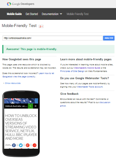
If your site is mobile-friendly then all is good and you have survived mobilegedden.
If your site is not mobile-friendly then, if like everyone else you rely on Google search rankings, you need to make your site mobile=friendly to avoid dropping down to page 17,547 or worse of Google’s search results.
How do I make my site mobile-friendly?
If you use a content management system (CMS), for example WordPress or Joomla, then you need to upgrade to the latest version of the CMS and apply a new theme. For WordPress, you could use the Twenty-Fourteen or Twenty-Fifteen themes which are mobile-friendly. For other CMS, just check our the relevant theme gallery for that CMS that are mobile-friendly and go for it.
If you don’t use a CMS and still use an old WYSIWYG HTML editor (like one of my older sites from the 1990s) then you need to make the switch to a CMS. A CMS resides on your hosting server and delivers up rendered pages to visitors. You author pages by logging into the admin section of your site from your browser and use the CMS to directly write your pages (also using What You See Is What You Get). The CMS theme you choose will automatically render mobile-friendly pages to mobile devices and normal pages to non-mobile devices.
Install a CMS on your hosting server now
Take the plunge and upgrade your site to a CMS. Once it is up and running, you will see how easy it is to author new content using just your web browser (no more Fileziller needed to upload content).
If you didn’t even know what a CMS was (or you’re still not sure) then I suggest installing WordPress as your CMS as it is very easy to use. Another easy CMS (but a bit harder than WordPress) is Joomla.
Contact your hosting provider now about installing a CMS to your site. It is much easier these days with most hosting providers using cPanel with a one-click install for WordPress, Joomla and other types of CMS.
For example, this site was up and running in only one hour when I bought a domain name, hosting and installed WordPress as the CMS using one-click install. I use Hostgator because it is cheap and has one-click install.
Check out hostgator.com or your own hosting provider and get mobile-friendly now.
Leave a Reply